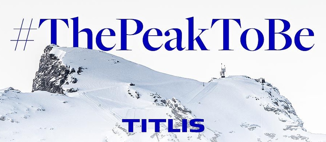
ThePeakToBe – New Brand Identity For Titlis
The Titlis Bergbahnen now presents itself with a new brand identity. It reflects the strategic realignment that the forward-looking “Project Titlis” brings with it. As #ThePeakToBe, Titlis stands for an iconic peak that enables adventures to be remembered for a lifetime.
In the next few years, a new pioneering spirit will be noticeable and visible on the Titlis. The architects Herzog & de Meuron designed the “Project Titlis”, which includes the expansion of the directional beam tower, a new mountain station and an additional railway line to the summit. “By 2029, unique architecture and first-class gastronomy will be created on the Titlis for future generations,” says CEO Norbert Patt. “The experience of visiting this iconic mountain in the heart of Switzerland is greatly enhanced in quality.”
An important step into the future, which is also reflected in the Titlis brand, which was further developed and repositioned parallel to the architectural upgrade of the summit. In the future, the Titlis brand will be defined by a strong, unmistakable and independent appearance. “The new appearance makes it easier to tell the Titlis and Engelberg-Titlis brands apart,” says Norbert Patt. «Of course nothing will change in the excellent cooperation between the mountain railways, the tourism destination and the other partners in Engelberg. We continue to strive together to provide all guests with an unforgettable experience.”
Digitally compatible and internationally understandable
The timeless new look of the brand, developed in collaboration with the corporate branding agency Markenfels, ensures that the identity of the Titlis is quickly revealed to an increasingly international and digitally savvy audience. The claim #ThePeakToBe, formulated as a hashtag, expresses that Titlis is a mountain that you have to experience. It stands for impressive nature, first-class enjoyment and unique architecture – for pioneering experiences that you will remember for a lifetime.
In addition to the new text logo, the graphic design elements are particularly noticeable, such as the iconic “T”. It consists of dynamic lines and is reminiscent of the steel structure of the new observation tower. In terms of color, the brand will shine in energetic blue in the future. “We have significantly reduced the brand design compared to the old appearance, so that it works well in the digital environment and on mobile devices,” explains marketing manager Urs Egli. «The new brand identity should be internationally understandable and convey at a glance what an incomparable mountain Titlis is.
The new brand identity is now visible and gives the Titlis a recognizable identity on the way to a new, exciting future.