Brundage Mountain Resort Launches New Brand
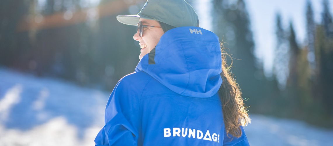
f you logged on to Brundage Mountain Resort’s website today, you probably noticed that it looks a little different. Brundage is launching a new logo and brand identity to better match the independently owned resort’s vision for the future.
The brand promise, “Mountain First, Mountain Always”, is a reflection of the ownership group’s commitment to keeping the on-mountain experience as the top priority as it invests in the 62-year-old resort.
A group of Idaho-based investors, mostly made up of families who’ve skied at Brundage for multiple generations, acquired the resort in November of 2020. Since then, the resort has mapped out plans for future improvements, which include the new Centennial Express High-Speed Quad (opening early December), a new 12,000 square foot Mountain Adventure Center facility (opening fall of 2024) and the resort’s first ski in/ski out lodging, all meant to streamline and enhance the guest experience.
“Brundage Mountain has been known for “The Best Snow in Idaho” for decades,” says Brundage Mountain General Manager, Ken Rider. “The people who love Brundage know that it’s about so much more than just the incredible Northern Rockies snow. It’s about coming to a friendly, low-key place where people who love the outdoors can enjoy what nature provides but also enjoy each other’s company, good food, fun events, and where they can create great memories and family traditions.”
The $25-30 million initial investment is focused largely on enhancing that experience and creating better flow on the mountain; from the arrival process in the parking lot to the time spent on the mountain and the après ski experience. Improving the flow as the skiing and snowboarding population grows is crucial so guests can get right to the slopes without needless hassles or delays.
A new logo and color scheme are meant to serve as visual reminders that the focus of the improvements is to enhance, but never eclipse, the experience people have on the slopes.
The prominence of the triangular mountain icon in the logo is the primary symbol. The triangle is a notoriously strong, stable shape that communicates how the consistency of the on-mountain experience will continue to be the top priority and a stabilizing force as Brundage Mountain navigates growth and charts a course for the future. The color scheme is based in nature, but with a noteworthy uniqueness and vibrancy that symbolizes what the resort’s guests bring to the experience with their laughter, excitement and appreciation for this time-tested retreat.
“We strongly believe a ski resort’s true brand is the experience that people have while they’re here,” says Rider. “Logos and fonts are simply the symbols we use to communicate that we are thinking of the Mountain First and will be prioritizing the Mountain Always.”
